Dashboard 2.0.
January to March 2022

About this Project
The product is a cloud-based restaurant management software solution that helps the restaurant industry people manage their operations from point-of-sale systems to back-office functions.
Since we acquired the product, we've been working on bringing together a new user interface that blends an existing system with valuable data insights.
This new dashboard is our first major step toward creating a seamless experience for both brand users. And we have noticed a few pain points in the existing system, such as not being able to see analytics data and having fewer action items than needed. The case study walks you through the process of fixing those limitations by redesigning.
Role
Product design, Visual Design, and User Testing.
Challenges
- The current dashboard platform is being used by several enterprises with different users and data, each with its own processes.
- The main challenge was to change the look and feel of the dashboard by changing the user interface to help the company win customers and achieve brand migration.
Goals
- Update the visual style of the entire dashboard to match the brand's design system and branding guidelines.
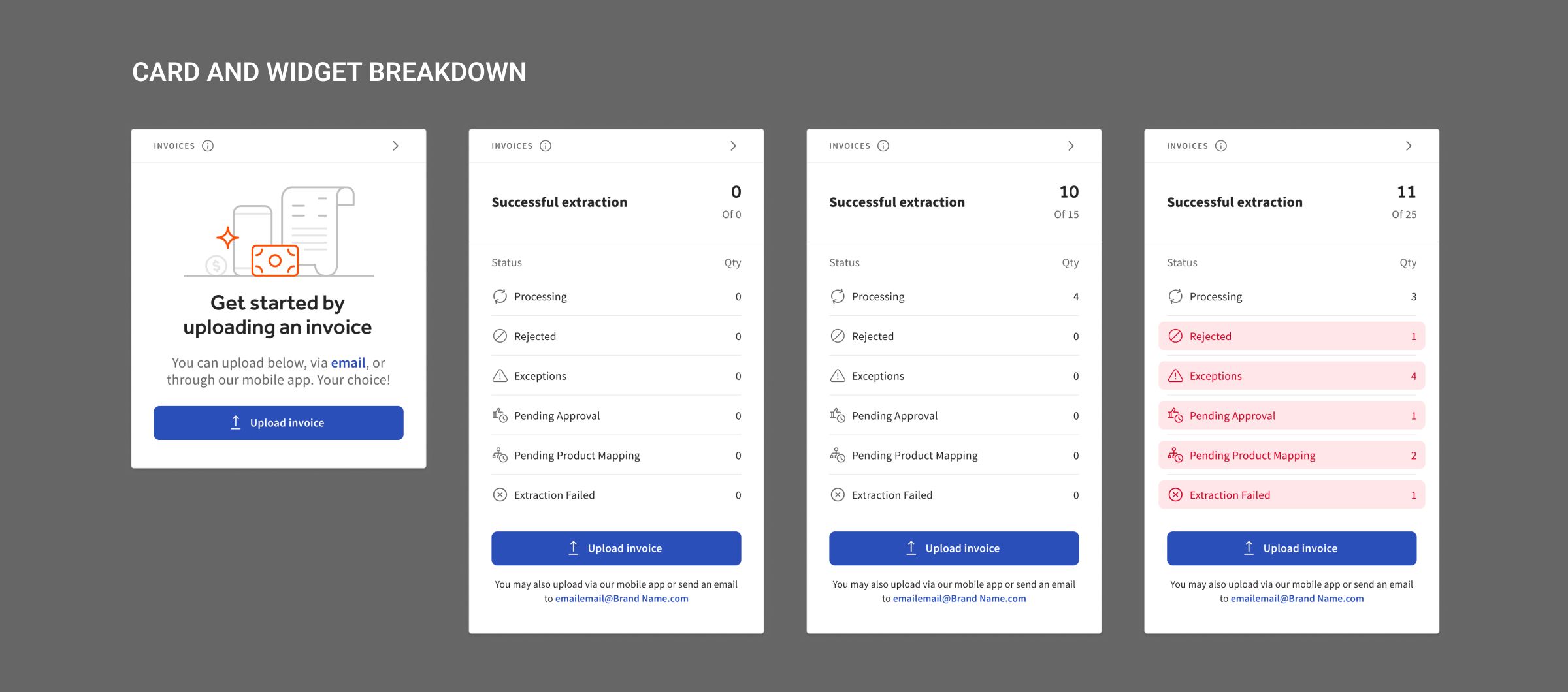
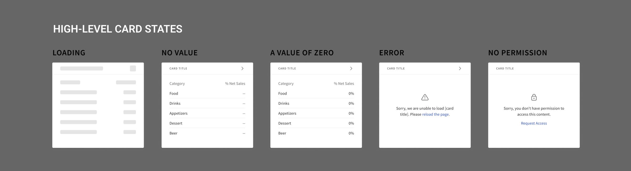
- Update the widgets in the dashboard so they're more actionable and provide summaries.
- Improve the visual appearance of the navigation menu and top bar as well as the main content on the dashboard.
- Provide a mobile version of the dashboard.
The Approach:
- Gather the analysed UX data
- Create a Visual Design or UI Design
- Make Prototype out of Visual Design
- Motion Design for required places
- User Testing on Prototype
- Design mobile UI.
Designing UI
I’ve updated the visual theme of the page by applying the composition, typography, and colors from the brand’s existing design system.
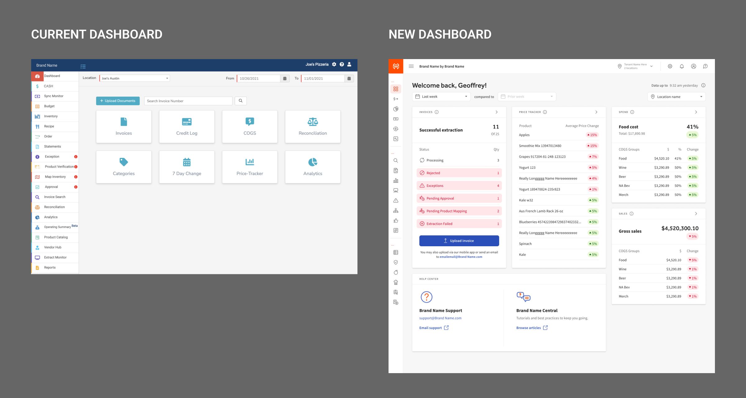
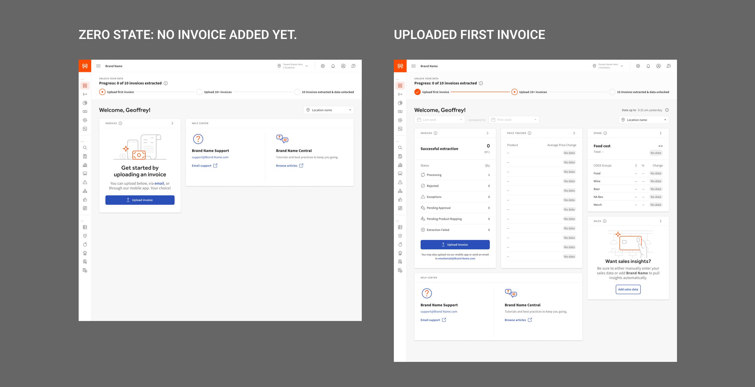
The new Dashboard shows the performance of key indicators from the previous period of time. The indicators are Revenue, Orders, and Food Cost/COGS as well as Invoices from Products. This dashboard also has helpful links and extra filters that can be used to get more information.
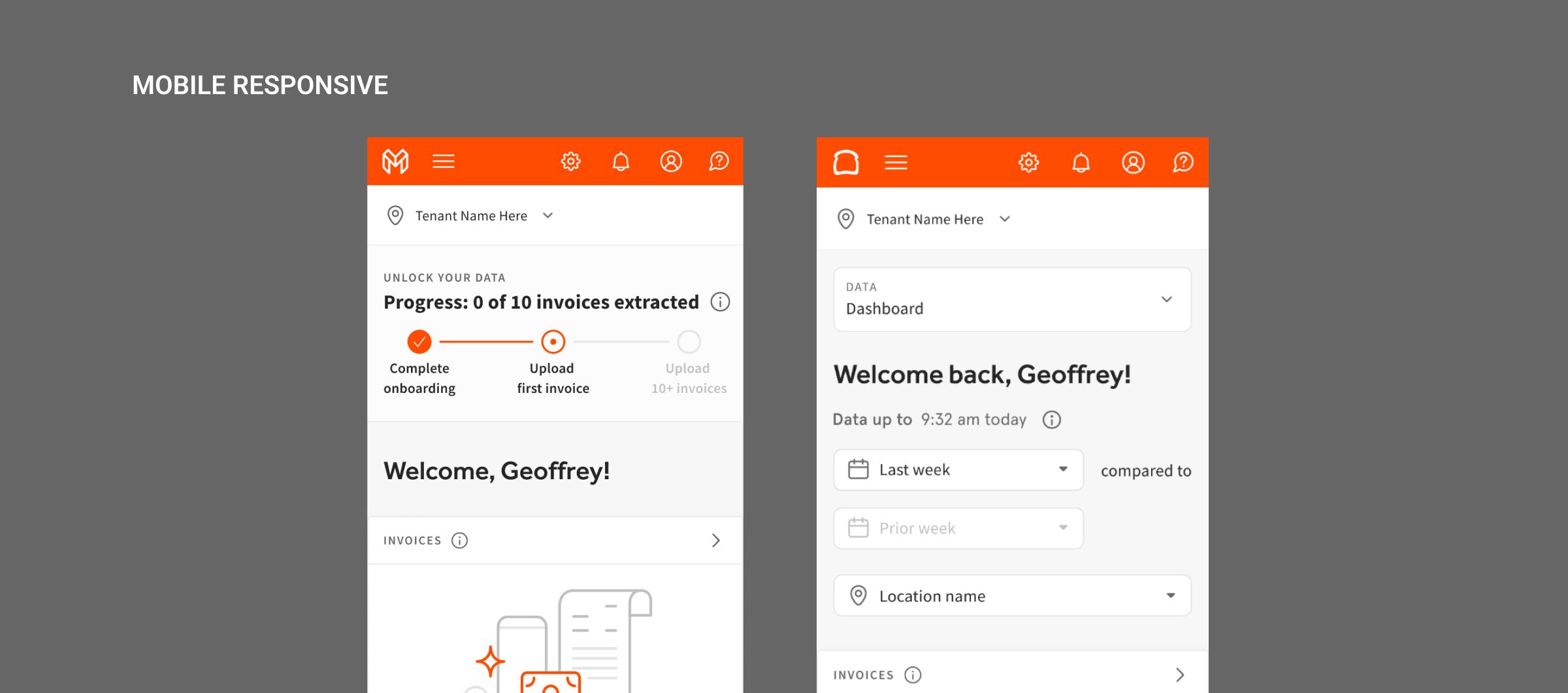
Designing Mobile UI
Delivering a responsive mobile version of the Dashboard was one of our project goals. I’ve preserved all of the key indicators and features and placed them within a single screen while keeping the page layout readable and intuitive.
Results
We launched Dashbord2.0 successfully and are now using it in large restaurants, small/medium businesses, and individual users. They are all pleased with the new platform's usability.

Let’s chat!
If you would like to discuss a project or coaching,
feel free to get in touch:
 Schedule a meet-up
 Mail Me
 Linkedin